





This article may include affiliate links. We may earn a small commission if you shop through them.
Two major design outlets published near-identical warnings this week: your living room furniture arrangement is probably working against you. Between pushing everything against the walls, buying matching sets, and ignoring how people actually move through the room, there are a few habits that quietly make a space feel smaller and more dated than it needs to
Here’s what the mistakes actually are — and exactly what to swap in instead.
Mistake #1: Pushing All Your Furniture Against the Wall
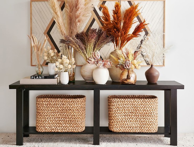
It feels like the obvious move, especially in a smaller room — shove the sofa and console against the perimeter to “open up” the middle. But designers consistently point out that this actually makes a room feel less lived-in, not more spacious. Furniture pulled slightly off the wall, with a console or chair “floating” to define a zone, reads as intentional rather than empty.
The fix: Instead of tucking your console flush against the wall behind the sofa, pull it a few inches out and let it anchor its own space. The Reed Console Table (40″) is a great narrower option for this if your room is on the smaller side, while the Bozeman Console Table (60″) works well as a floating piece in larger layouts. If you’d rather create a floating moment with seating, the Atwood Chair is compact enough to angle away from the wall without eating up floor space.
Mistake #2: Buying a Matching Furniture Set
This is the one getting the most attention right now — designers are saying flat-out that a matching set is what ages a room the fastest. A coffee table, end tables, and console all in the same finish reads as a package deal, not a considered space.
The fix: Mix your materials on purpose. Pair a glass coffee table with a wood or metal end table so each piece reads as its own decision, not a set piece.
Everson Rectangular Glass Coffee Table (52″) — a clean, light anchor for the center of the room
Allen Rectangular Tiered End Table (14″) — a warmer, tiered wood option to break up the glass
Round Metal Drink Table (9.5″) — small enough to tuck beside a chair for a third material in the mix
Mistake #3: Ignoring Traffic Flow
The most overlooked mistake: arranging furniture for how a room looks in photos rather than how people actually walk through it. Oversized pieces or one console that spans an entire wall can block the natural path between rooms, forcing awkward detours.
The fix: Scale down. A narrower console or a chair with a smaller footprint keeps a walkway clear without sacrificing seating or storage.
Reed Console Table (40″) instead of the 84″ Reed Grand Console Table if you’re working with a tighter path
Atwood Chair — a lower-profile seat that doesn’t crowd a walkway the way a bulkier chair would
Montgomery Swivel Stool — flexible extra seating that can tuck away when it’s not needed
FAQ
What’s the biggest living room layout mistake?
Designers consistently point to pushing all furniture against the walls — it tends to make a room feel emptier and less intentional, rather than more spacious.
Do matching furniture sets look dated?
According to recent designer commentary, yes — a coffee table and end tables in the same finish read as a packaged set rather than a considered, layered room.
How do I fix a small living room layout?
Focus on scale rather than removing pieces entirely. Narrower consoles, smaller-footprint chairs, and furniture that floats slightly off the wall all help a small room feel more open without sacrificing function.
Shop the Full Selection
All the pieces featured in this article — scroll to explore.
-
 SHOP THE ITEM →
Brown Terracotta Striped Vase
-
 SHOP THE ITEM →
Dreamy Handwoven Fringe Throw
-
 SHOP THE ITEM →
Benchwright Round End Table (23″)
-
 SHOP THE ITEM →
Tanner Round Glass Accent Table (12″)
-
 SHOP THE ITEM →
Rockport Square Wood Coffee Table (44″)
-
 SHOP THE ITEM →
Jake Leather Swivel Stool
-
 SHOP THE ITEM →
Malibu Woven Bench (64″)
-
 SHOP THE ITEM →
Delaney Round Marble C-Table (10″)
-
 SHOP THE ITEM →
Maison Leather Backless Swivel Bar & Counter Stools
$299.00 -
 SHOP THE ITEM →
Reed Grand Console Table (84″)
$799.00 -
 SHOP THE ITEM →
Malibu Woven Backless Bench (52″)
$799.00 -
 SHOP THE ITEM →
Montgomery Swivel Stool
$399.00 -
 SHOP THE ITEM →
Delaney Marble Bar Console (34″)
$599.00 -
 SHOP THE ITEM →
Aubrey 3-Drawer Storage Cabinet (36″-72″)
$899.00 -
 SHOP THE ITEM →
Allen Rectangular Tiered End Table (14″)
$349.00 -
 SHOP THE ITEM →
Round Metal Drink Table (9.5″)
$149.00 -
 SHOP THE ITEM →
Everson Rectangular Glass Coffee Table (52″)
$799.00 -
 SHOP THE ITEM →
Reed Console Table (40″)
$399.00 -
 SHOP THE ITEM →
Aubrey Entryway Bench
$499.00 -
 SHOP THE ITEM →
Carlisle Chair
$1,249.00 -
 SHOP THE ITEM →
Malibu Woven Bar & Counter Stools
$699.00 -
 SHOP THE ITEM →
Atwood Chair
$699.00 -
 SHOP THE ITEM →
Irving Roll Arm Swivel Chair
$1,099.00 -
 SHOP THE ITEM →
Penelope Chaise
-
 SHOP THE ITEM →
Herringbone Twisted Tassel Throw
$99.00 -
 SHOP THE ITEM →
Heritage Fair Isle Pillow Cover
$59.50 -
 SHOP THE ITEM →
Summerville Secretary Desk (41″)
$2,399.00 -
 SHOP THE ITEM →
Lainey Hand-Knotted Rug
$999.00 -
 SHOP THE ITEM →
Bozeman Console Table (60″)
$1,199.00 -
 SHOP THE ITEM →
Coralie Striped Lumbar Pillow Cover
$89.50 -
 SHOP THE ITEM →
Devin Floral Pillow Cover
$39.50 -
 SHOP THE ITEM →
Green and White Luna Vase
$19.98 -
 SHOP THE ITEM →
Blake Woven Rattan Jug Vase
$58.00 -
 SHOP THE ITEM →
Floral Glazed Ceramic Maisie Vase
$19.99 -
 SHOP THE ITEM →
Cream and Blue Luna Vase
$48.00 -
 SHOP THE ITEM →
Green and White Distressed Floral Vase
$38.00 -
 SHOP THE ITEM →
Green and White Distressed Vase with Handle
$48.00 -
 SHOP THE ITEM →
Antonia Woven Vase
$148.00
You Might Also Enjoy
- Pottery Barn Pillows Actually Worth Buying Right Now
- LoveShackFancy Furniture: 5 Pieces That Feel Right at Home
- 15 MacKenzie-Childs Teapots That Make Your Kitchen Feel Magical
- The Best Plants for Home Decor That Make Every Room Look More Expensive
- The Pottery Barn Rugs Worth Buying vs. the Look-for-Less